ampm Convenience stores
building an app for loyalty

We were asked to audit ampm’s official app (previously named Scratch Power), assess the user registration and password reset flows and reorganize the existing content to accommodate for new upcoming features, while creating a more intuitive and frictionless experience for its customers.
Challenge
Responsibilities
Competitive Audit, Information Architecture, Wireframes
the problem
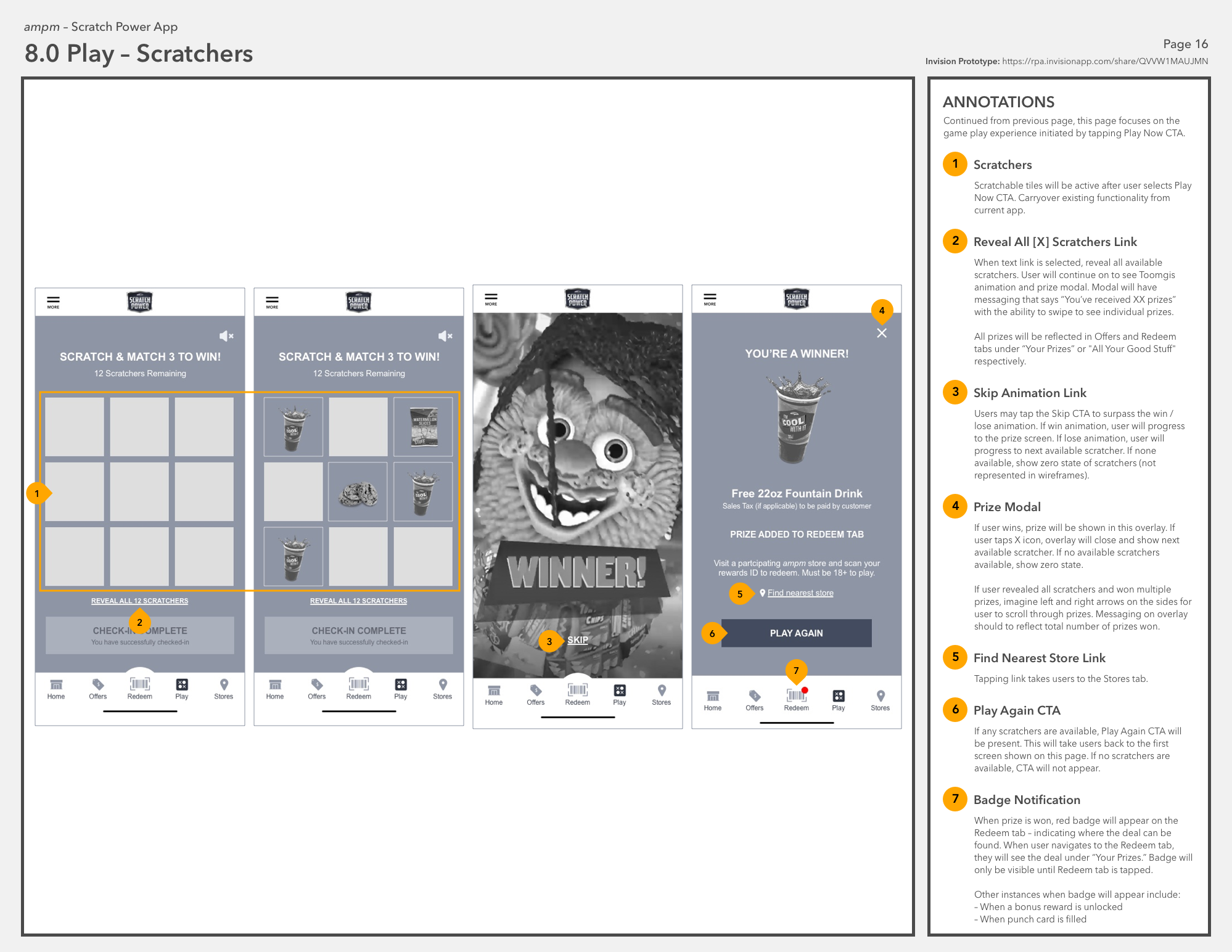
As the Scratch Power app gained new features and capabilities over the years, it became disjointed and unintuitive. The original purpose of the app was for users to earn scratchers and play to win prizes. More recently, the app added frequent buyer cards and a coffee subscription program without revisiting the app hierarchy, thus creating an experience that felt like an afterthought and buried. New features were hidden behind the “More” option in the navigation.
process
I conducted a thorough audit comprised of the ampm app, its industry competitors and any other apps that might have similar features. Through this exercise, I gained a deep understanding of enjoyable experiences and found some inspiration to draw from. In my assessment of about 10 brands, I created accounts to experience the sign up / log-in process, browsed store locators, offers and any available loyalty programs. Over the days, I returned to most the apps, conveniently forgot my passwords, and got to experience those user flows organically as well!
Auditing the Industry

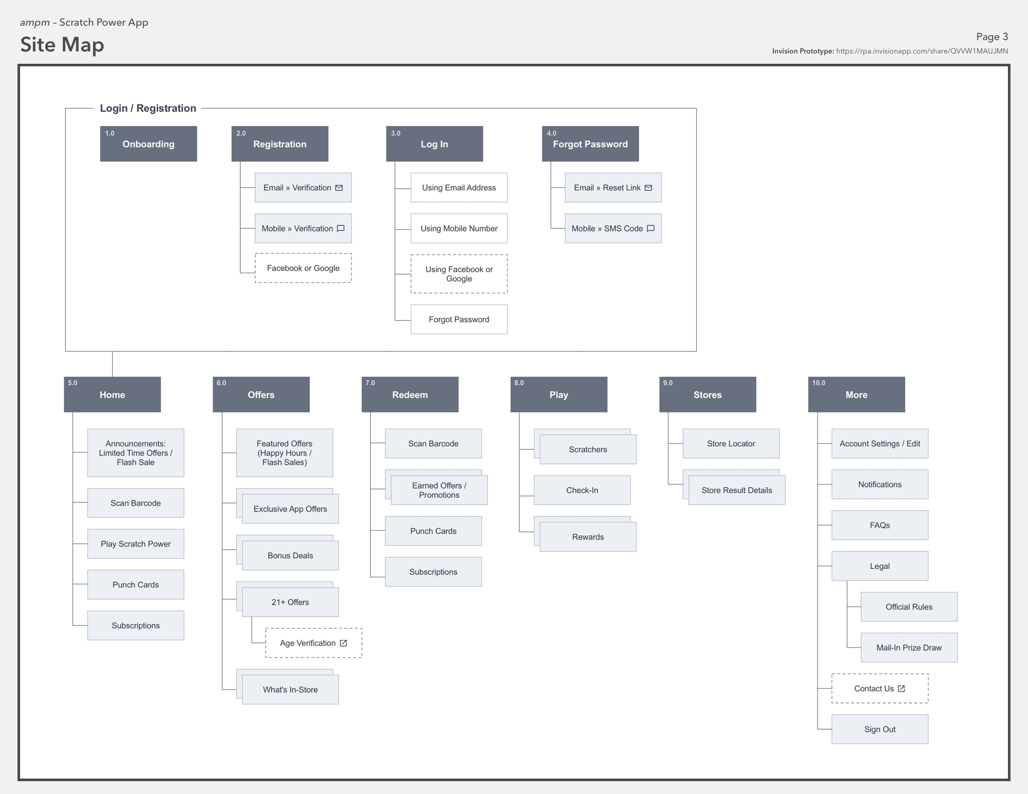
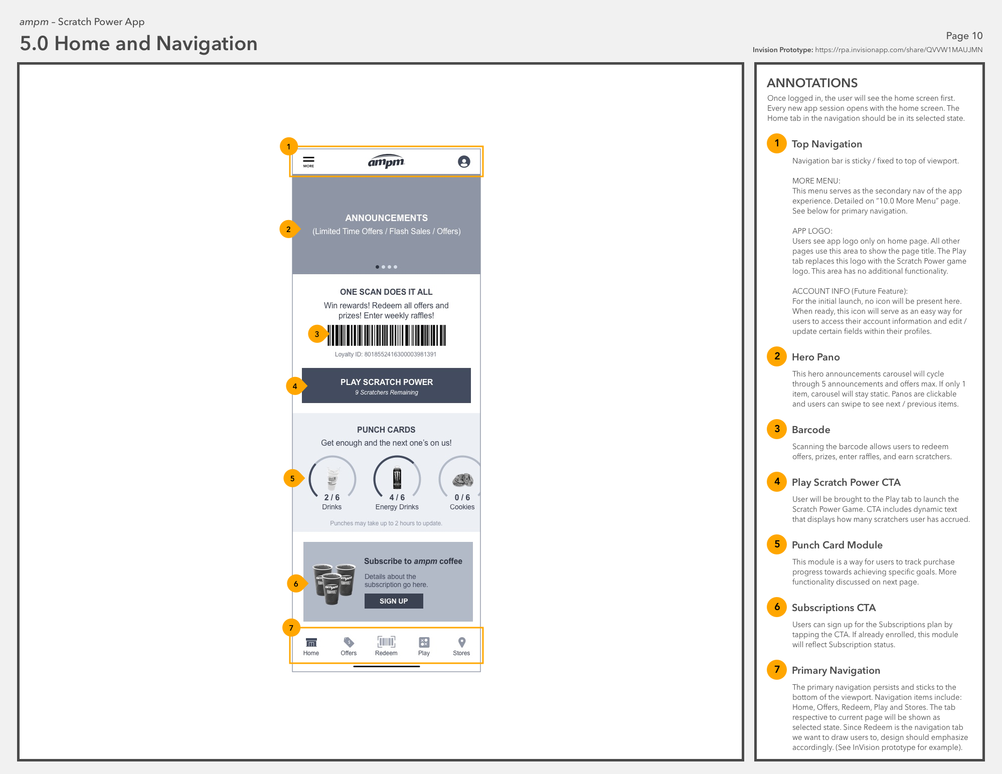
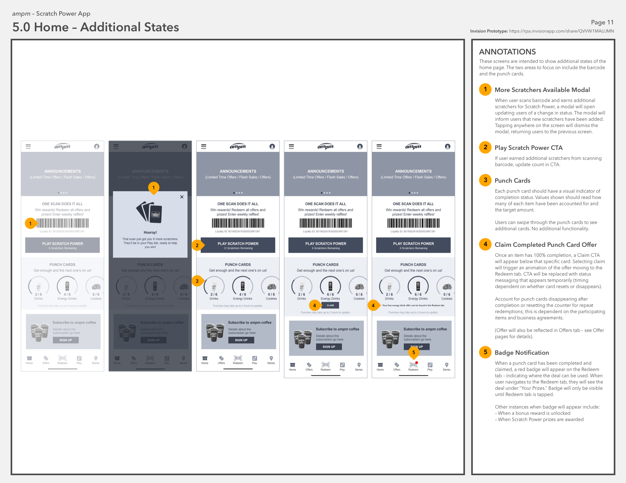
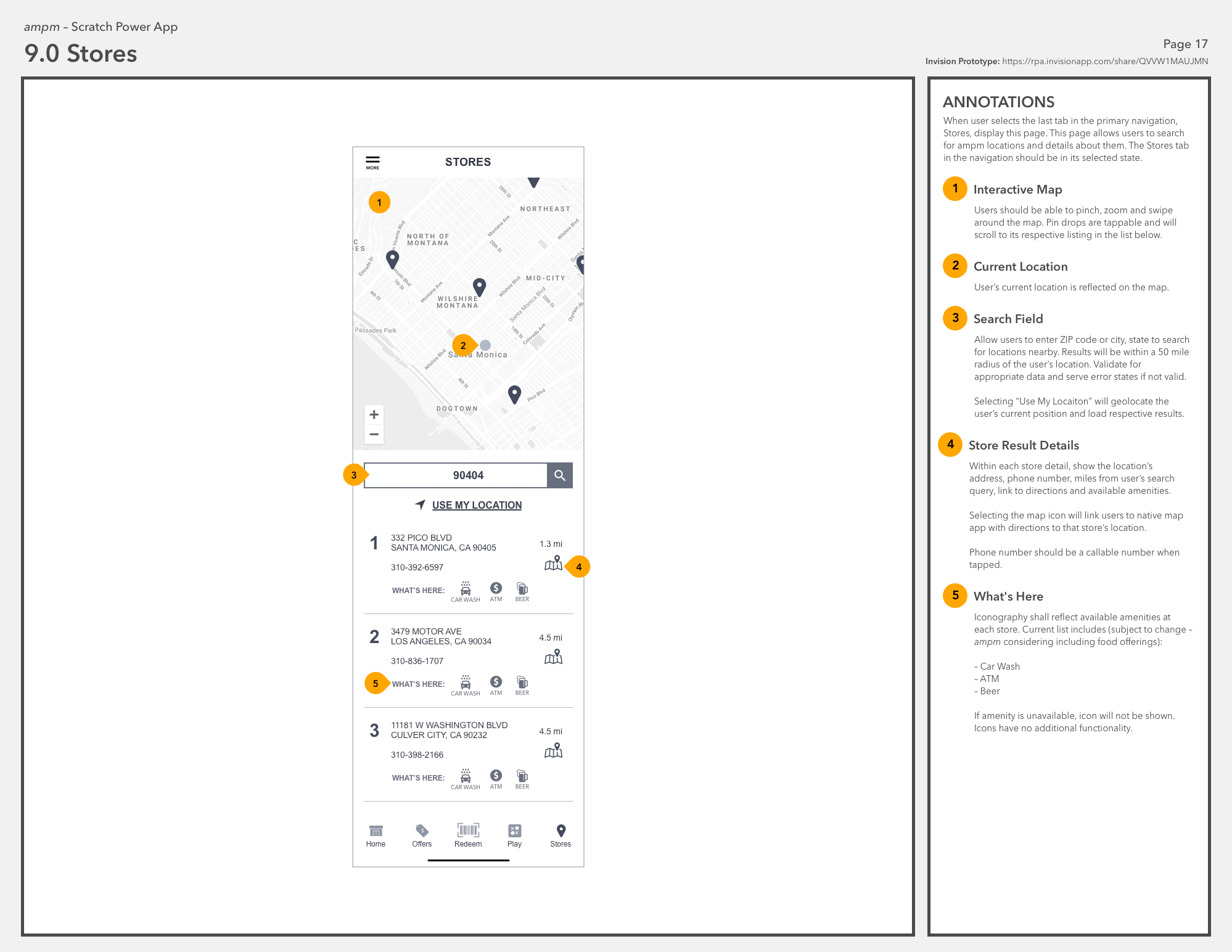
The new ampm app was built to scale up and accommodate its current and upcoming features. We designed the navigation to be more customer-centric by grouping related content together and labeling the tabs clearly to set user expectations properly. We prioritized the content we expected users to access frequently and placed them on the homepage for easy accessibility. This content included their barcode (to redeem prizes, earn scratchers, etc.), a button to check-in when nearby an ampm store, frequent buyer cards, and coffee subscription information. Less frequented pages, like users’ account information or app settings, were deprioritized to the menu in the corner of the screen.
Wireframe Development
The clients asked us to find ways to reduce friction during the account sign up / password reset flows to increase account creation. The original processes required numerous steps, including switching between the app, email and browser (shown below).
REGISTRATION / SIGN UP / PASSWORD RESET
Original Account Registration Flow
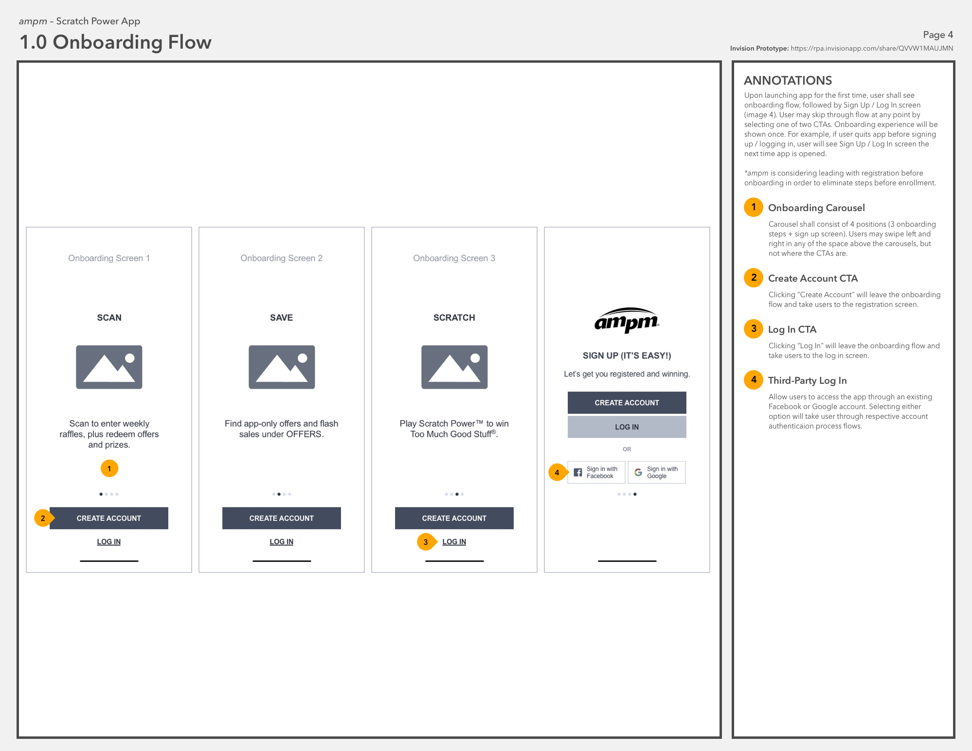
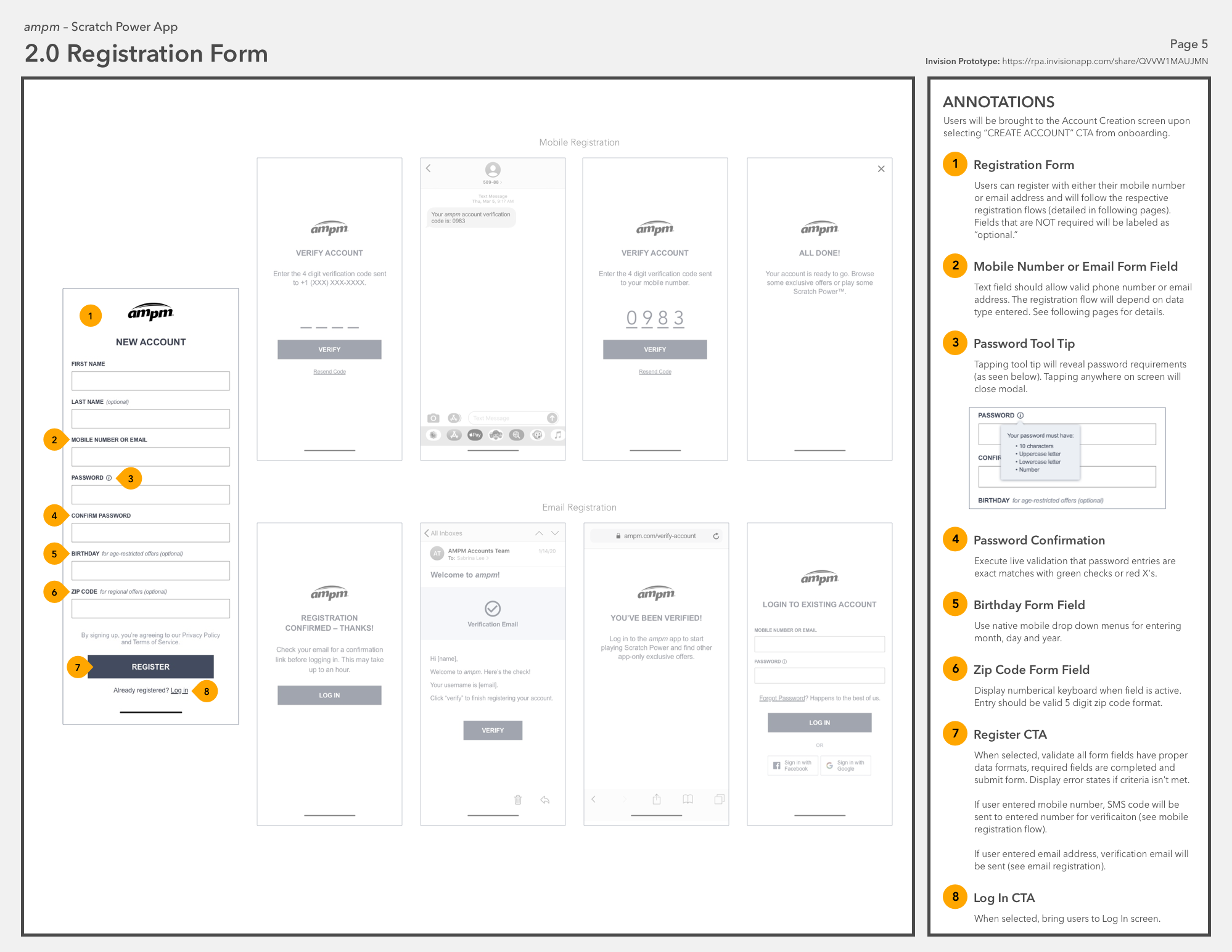
In rethinking these flows, we explored allowing users to sign up with their mobile numbers or existing social accounts (Facebook or Google). By allowing these new methods of account creation, we were able to significantly reduce the number of steps, thus creating a quicker, more intuitive process. If users forgot their passwords, our revised flow allowed them to enter either their email or phone number and pending what data type was submitted, the system would take users through an email or text based flow respectively.
New Account Registration Flow
While I was responsible for the UX design of the new ampm app, another agency handled the visual design and development for this build. In attempt to make the handoff between companies as easy as possible, I built a fully clickable prototype using Invision and wrote detailed functional specifications for the other teams to reference. Through a series of several calls, I lead the teams through the intended design and behavior of the app and clarified any questions that arose. Because our scope of the project was to solely create the user experience via wireframes, I was unable to give visual design feedback or weigh in on any design decisions as I typically do. The project is officially launched in the app store and I’m happy to see that the overall intended design and functionality were maintained.
Prepping for Handoff